A lesson in simulation game design and digital horse s...
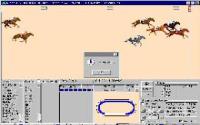
Imagine someone took the visual style of interface directly form Win 98, you know the bare minimum one, with light grey and the occasional indentation and, on top of that, windowed horse race visual representation based on sprites is slapped. That's exactly how Horse Racing Fantasy 3.0 feels like, a game that simulates horse racing but doesn't really care about creating an interface for the game that keeps the entire thing organized underneath an original looking set of graphics. The simulation itself, which is mathematical, I would say does a good job at averaging who is the winner of the race, calculating the race step by step, based on the training, energy, talent of the jockey etc. The graphical representation of the horses running is just added for looks only, it adds nothing to the game; you could play the game only by looking at the numbers. And so, while the simulation is alright, the visual representation is barren and unappealing. So, instead of being a racing horse game, this is more of a lesson in game design, how to hide or produce visual for your game, with Horse Racing Fantasy 3.0 as a counterexample, if you will! Nope, if horse racing is your thing, I'd say see Hooves of Thunder which is a much more enticing game.


